Highspot
Community login flow
Lorem ipsum dolor sit amet, consectetur adipiscing elit. Suspendisse varius enim in eros elementum tristique. Duis cursus, mi quis viverra ornare, eros dolor interdum nulla, ut commodo diam libero vitae erat. Aenean faucibus nibh et justo cursus id rutrum lorem imperdiet. Nunc ut sem vitae risus tristique posuere.
UI/UX Design · AI

The ask
Redesign the Spark Community login and onboarding experience to reduce confusion and create a clear, intuitive path to access.
The existing flow required users to choose between internal account types before signing in, using terminology that wasn’t meaningful to most users. Instead of quickly accessing their account, users were forced to interpret unfamiliar labels, leading to hesitation, incorrect choices, failed login attempts, and drop-off. Key moments like password recovery and account recognition were also unclear, adding friction at a high-intent entry point.
The goal was to shift the experience from a system-driven flow to a user-centered one by aligning with how people actually think: Do I have an account, and how do I log in?
Improvements needed:
- Simplify decision-making by removing internal terminology and reducing unnecessary branching
- Introduce account recognition to guide users to the correct path based on their email
- Prioritize SSO intelligently while still supporting email/password as a clear fallback
- Improve clarity in critical moments like password reset and account recovery
- Create a cohesive onboarding flow that supports both new users and existing Highspot customers
- Reduce friction at entry points to increase successful login completion and overall engagement
The outcome aimed to create a faster, more confident login experience that improves access, reduces support burden, and better supports community growth.
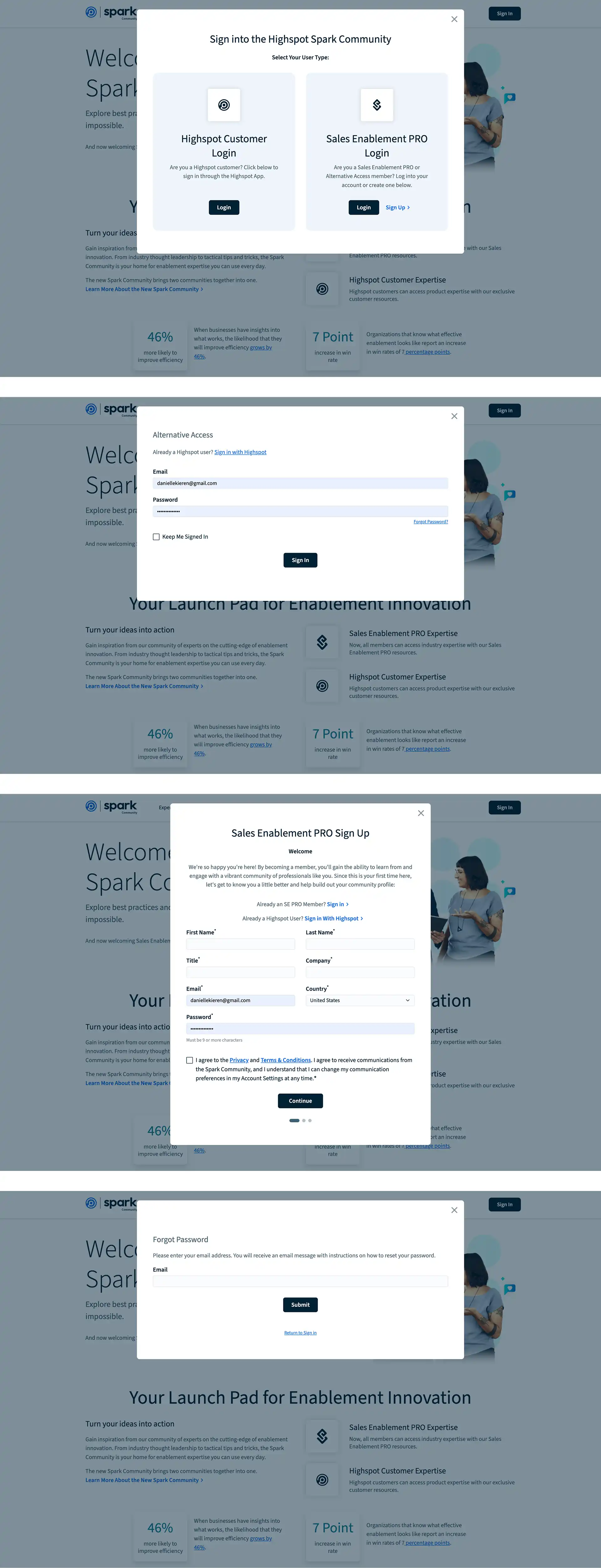
Existing flow
The existing login flow required users to choose between unclear account types before signing in, creating confusion at a critical entry point. Without clear guidance or account recognition, many users selected the wrong path, struggled to recover passwords, or abandoned the process altogether. This fragmented experience made access feel harder than it should be.
The existing login flow required users to choose between unclear account types before signing in, creating confusion at a critical entry point. Without clear guidance or account recognition, many users selected the wrong path, struggled to recover passwords, or abandoned the process altogether. This fragmented experience made access feel harder than it should be.
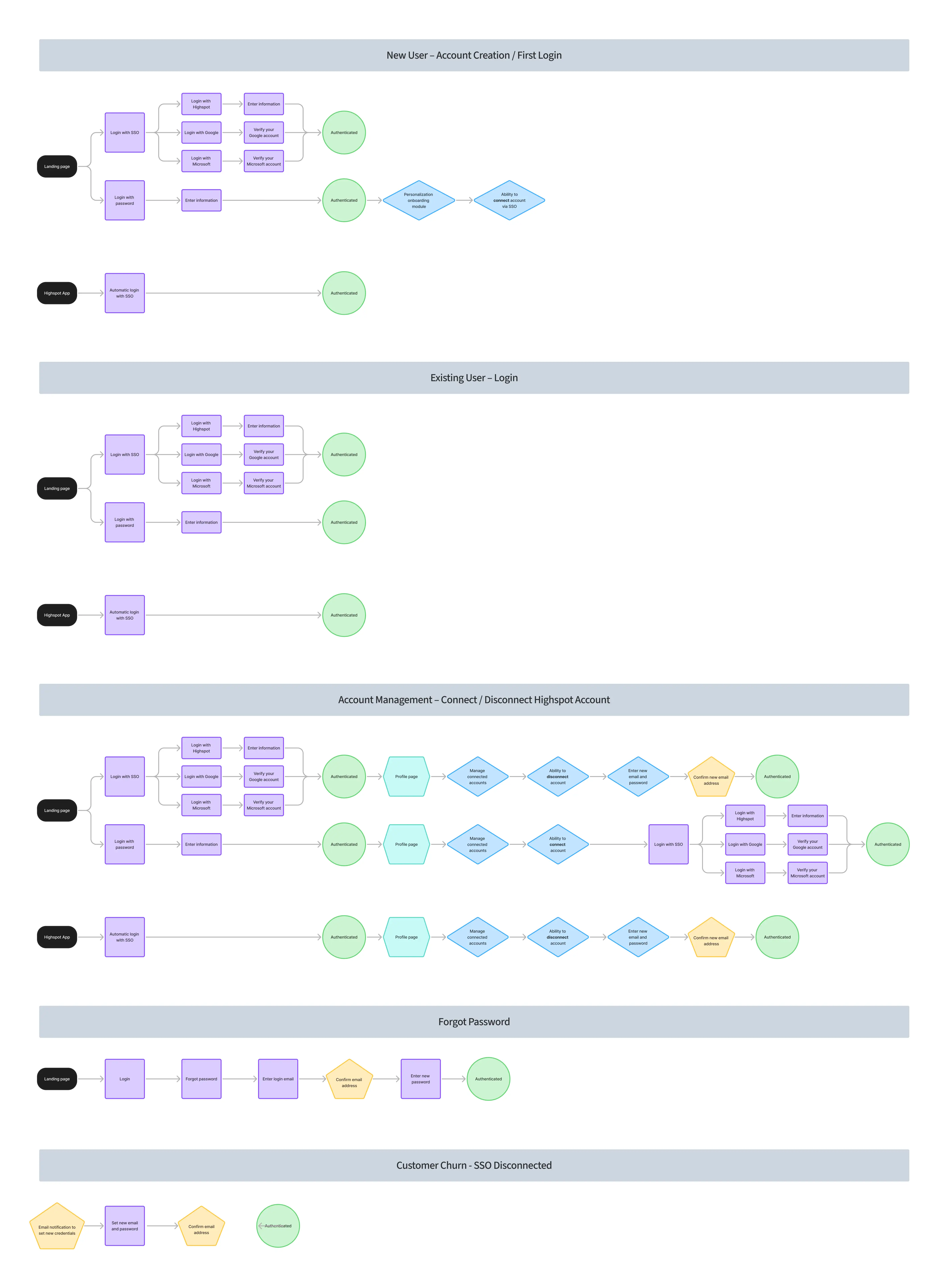
Redesigned user flows
To address the friction points in the existing experience, I mapped out a comprehensive set of user flows covering every login scenario: new account creation, existing user login, account management, forgot password, and customer churn. This ensured every path to access was intentional, clearly defined, and accounted for before a single screen was designed.
To address the friction points in the existing experience, I mapped out a comprehensive set of user flows covering every login scenario: new account creation, existing user login, account management, forgot password, and customer churn. This ensured every path to access was intentional, clearly defined, and accounted for before a single screen was designed.
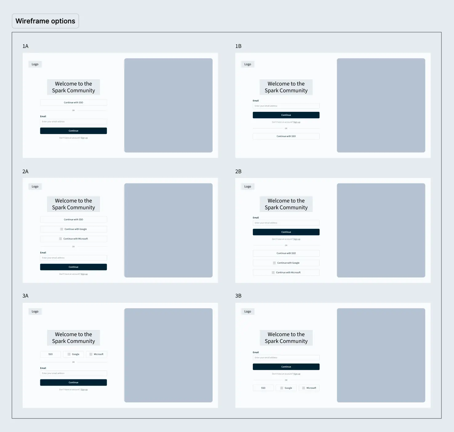
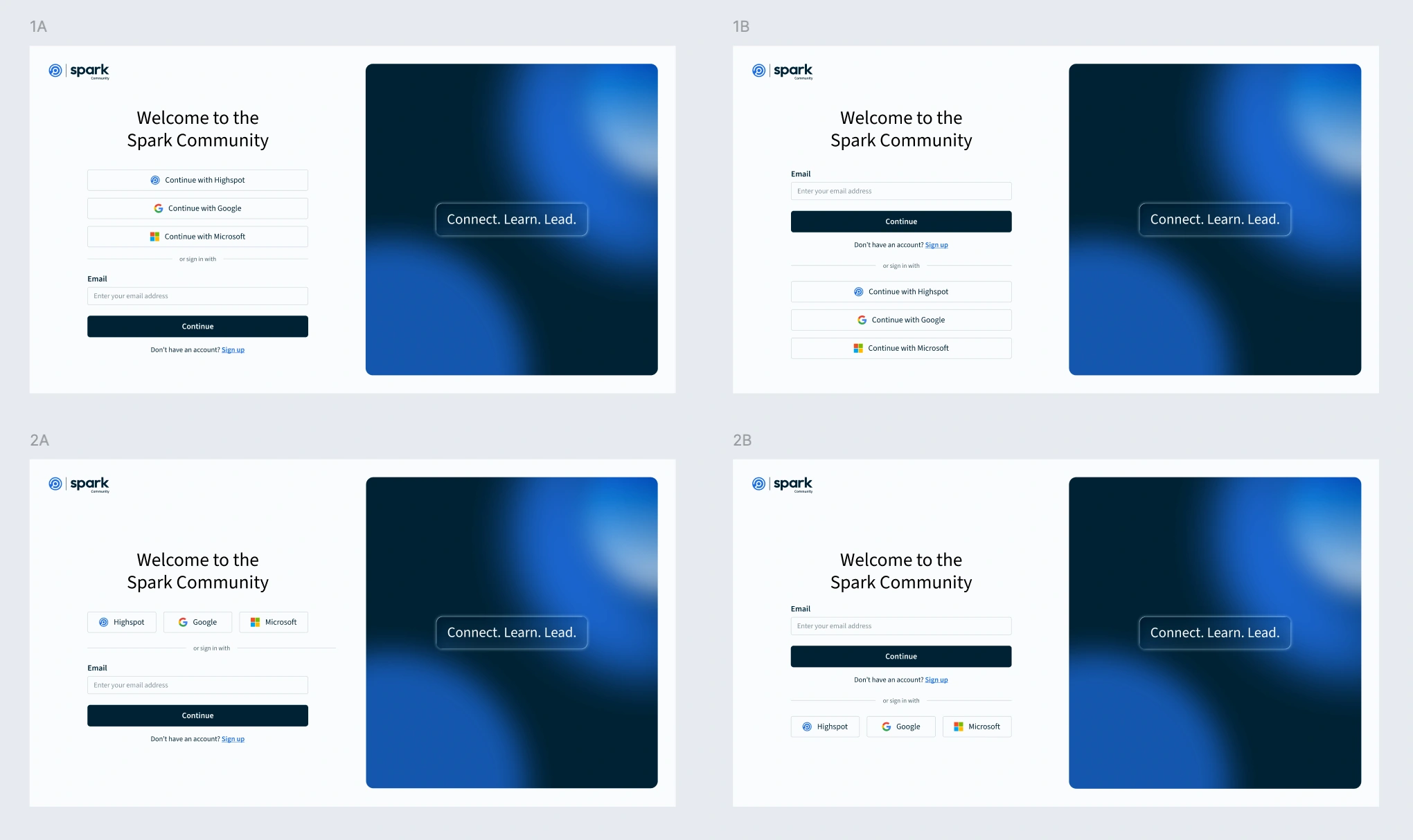
The designs
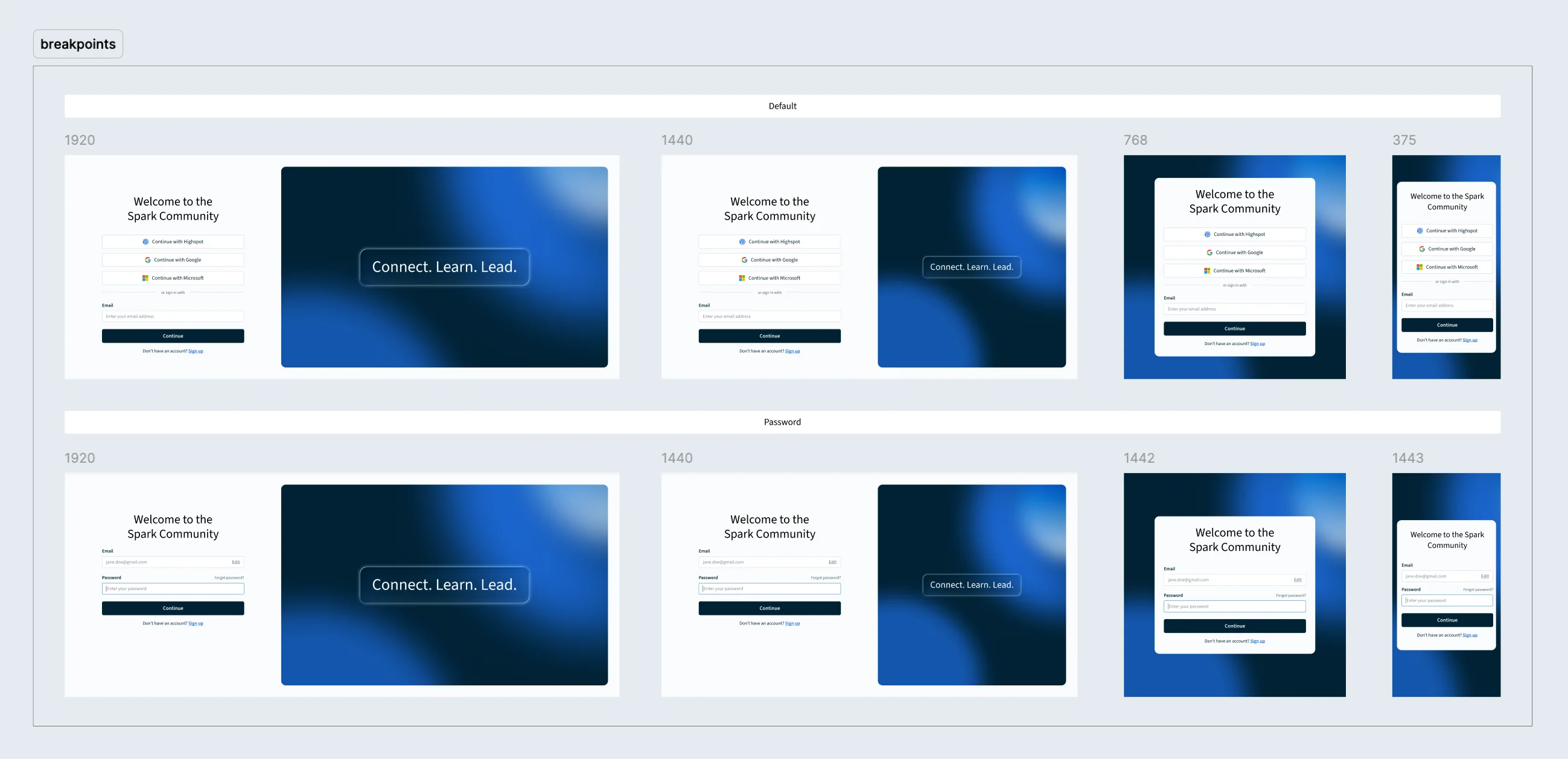
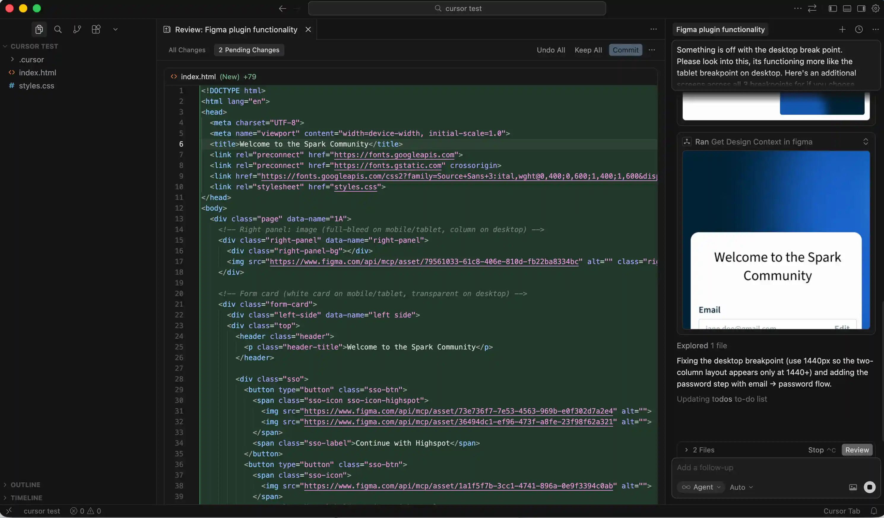
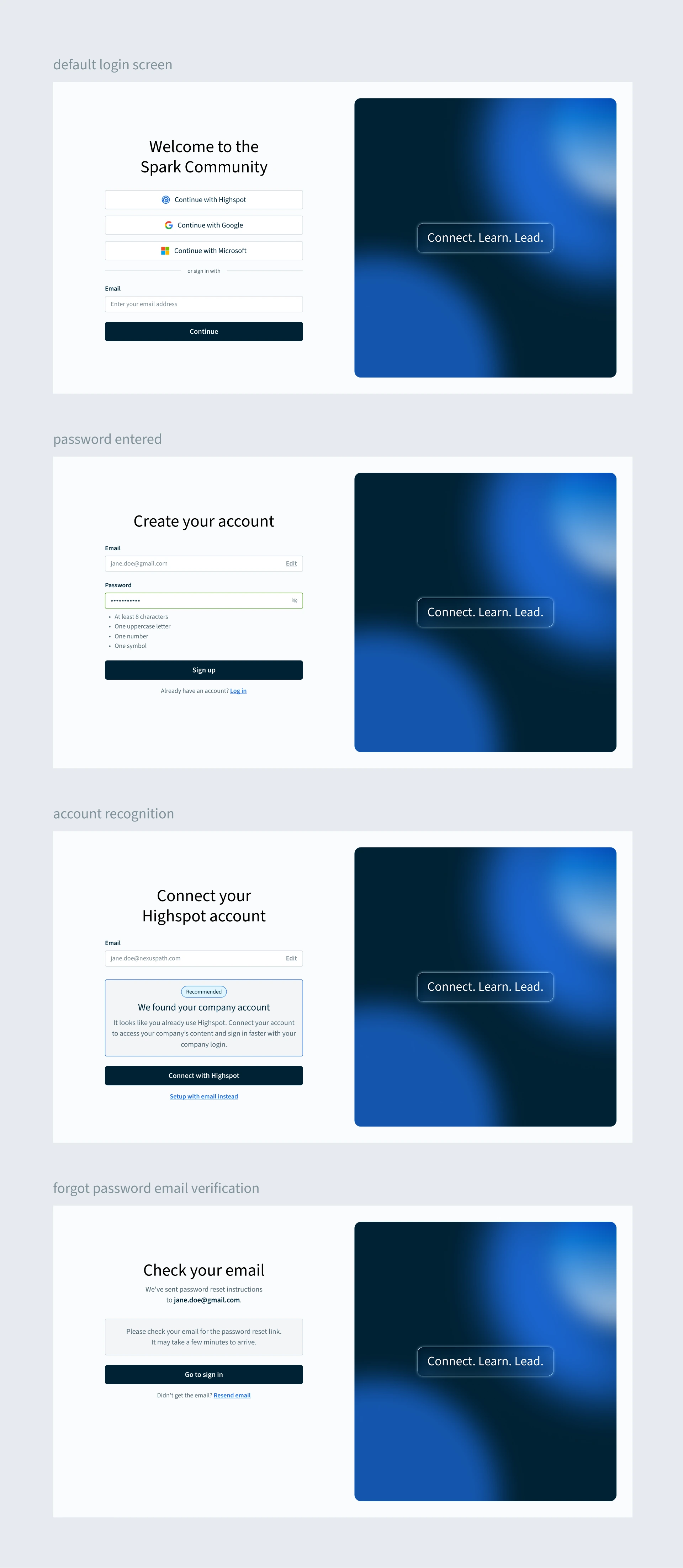
With flows mapped and wireframes validated, I designed every state of the new experience, from SSO login and email sign up to password recovery and account management. The two-card modal was replaced with a single, intelligent entry point that routes users based on account type. I used Cursor to prototype responsive breakpoints, streamlining developer handoff and ensuring precise implementation across screen sizes.
With flows mapped and wireframes validated, I designed every state of the new experience, from SSO login and email sign up to password recovery and account management. The two-card modal was replaced with a single, intelligent entry point that routes users based on account type. I used Cursor to prototype responsive breakpoints, streamlining developer handoff and ensuring precise implementation across screen sizes.


Results
Redesigned login flow for faster, more intuitive access to the Highspot Community site across all user types, reducing friction at known pain points and login errors, and cutting down on support email volume for the Community team.
More work

Project name
UI/UX Design

Project name
UI/UX Design