Highspot
Arctic design language
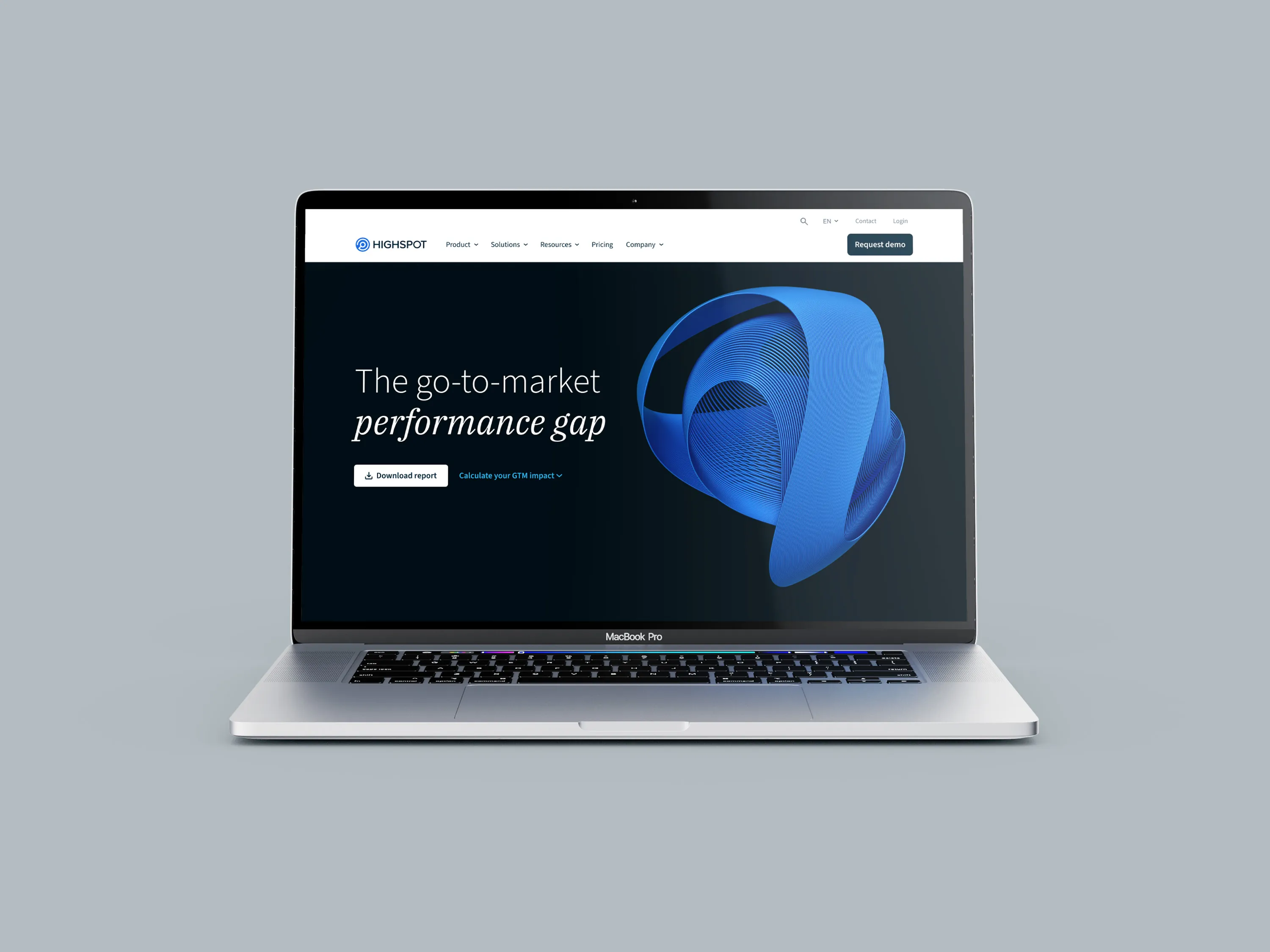
Arctic Flow is Highspot's design language for building beautiful, usable experiences across every product and touchpoint. This initiative brought together the full Expression team in deep collaboration to establish the visual and strategic foundations of the brand, from color and typography to tone of voice and photography, creating a cohesive system built to scale.
Branding · Art Direction
The ask
Highspot had grown significantly as a company, and the brand needed to catch up. With multiple product surfaces, marketing touchpoints, and an expanding global presence, the existing visual language lacked the cohesion and intentionality required to support the business at scale. The design team was tasked with building something from the ground up, a true design language that could serve as the foundation for every experience Highspot creates, from product UI to print collateral.
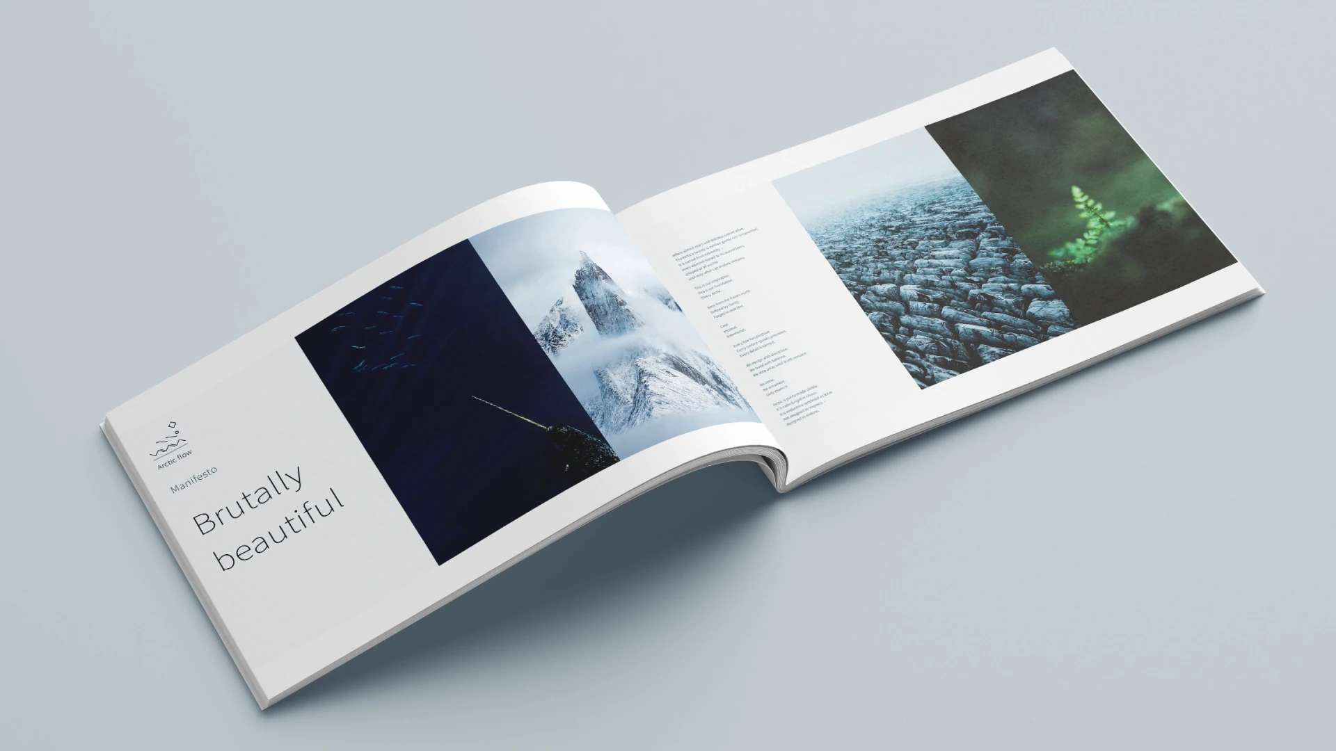
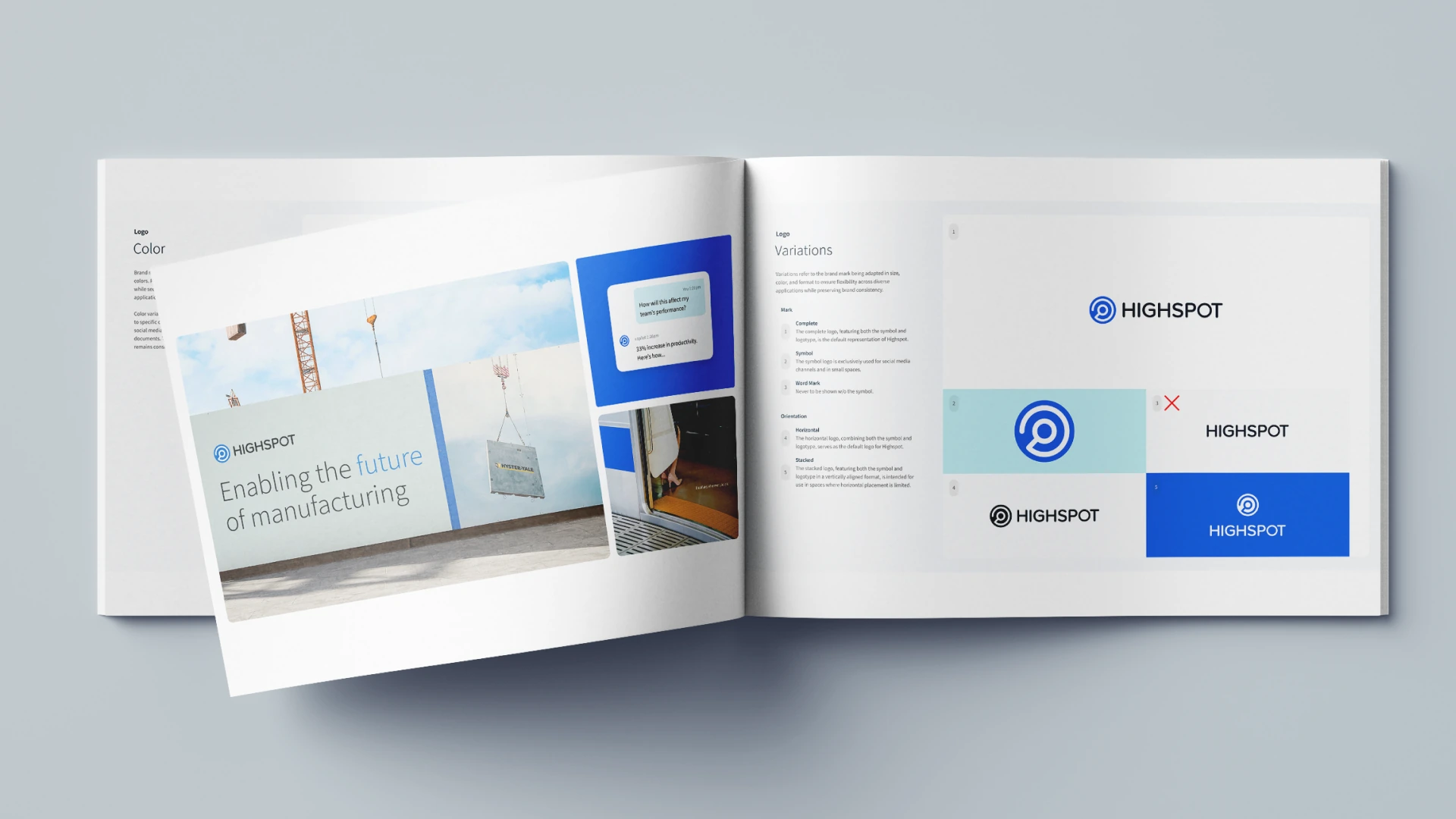
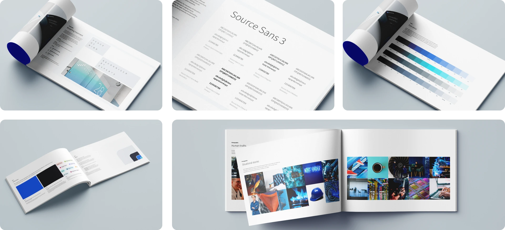
Arctic Flow was the answer. Rooted in deep arctic exploration, the initiative drew inspiration from the natural world of the arctic, its textures, light, movement, and vast landscapes, weaving these motifs into a design language that feels both distinctive and grounded. The team came together in deep collaboration to define not just how Highspot looks, but how it thinks and communicates, establishing the vision and values, tone of voice, typography, color system, logo refinements, and photography direction that would anchor the identity across all channels. The goal was to create a system that was both beautiful and functional, flexible enough to scale across surfaces while remaining unmistakably Highspot.
Arctic Flow was the answer. Rooted in deep arctic exploration, the initiative drew inspiration from the natural world of the arctic, its textures, light, movement, and vast landscapes, weaving these motifs into a design language that feels both distinctive and grounded. The team came together in deep collaboration to define not just how Highspot looks, but how it thinks and communicates, establishing the vision and values, tone of voice, typography, color system, logo refinements, and photography direction that would anchor the identity across all channels. The goal was to create a system that was both beautiful and functional, flexible enough to scale across surfaces while remaining unmistakably Highspot.
Team collaboration
Drove the Arctic brand forward through deep collaboration with the design team, aligning across countless working sessions to collectively define the visual language, vision and values, tone of voice, typography, color system, logo refinements, and photography direction that anchor the identity.
Drove the Arctic brand forward through deep collaboration with the design team, aligning across countless working sessions to collectively define the visual language, vision and values, tone of voice, typography, color system, logo refinements, and photography direction that anchor the identity.
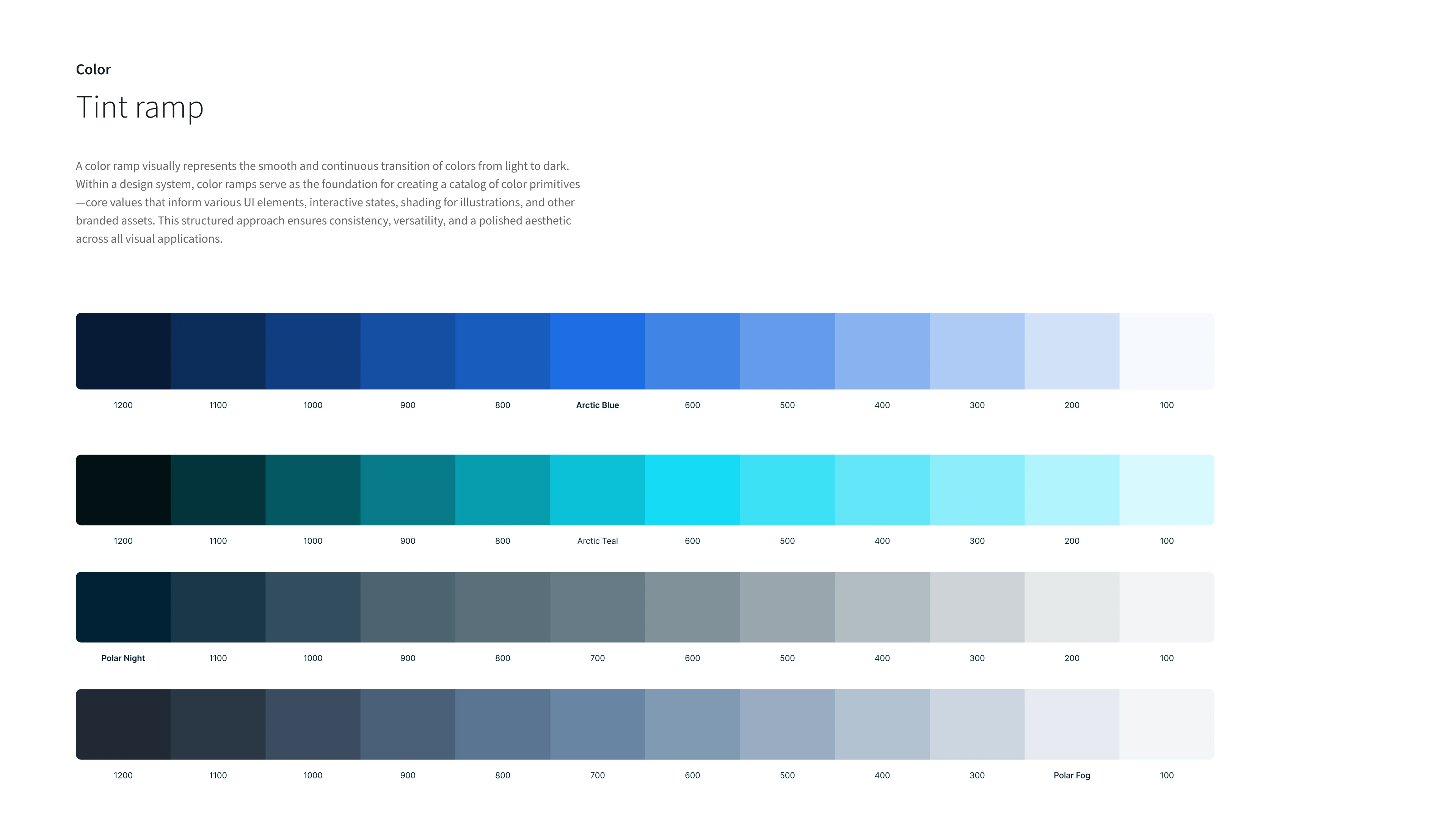
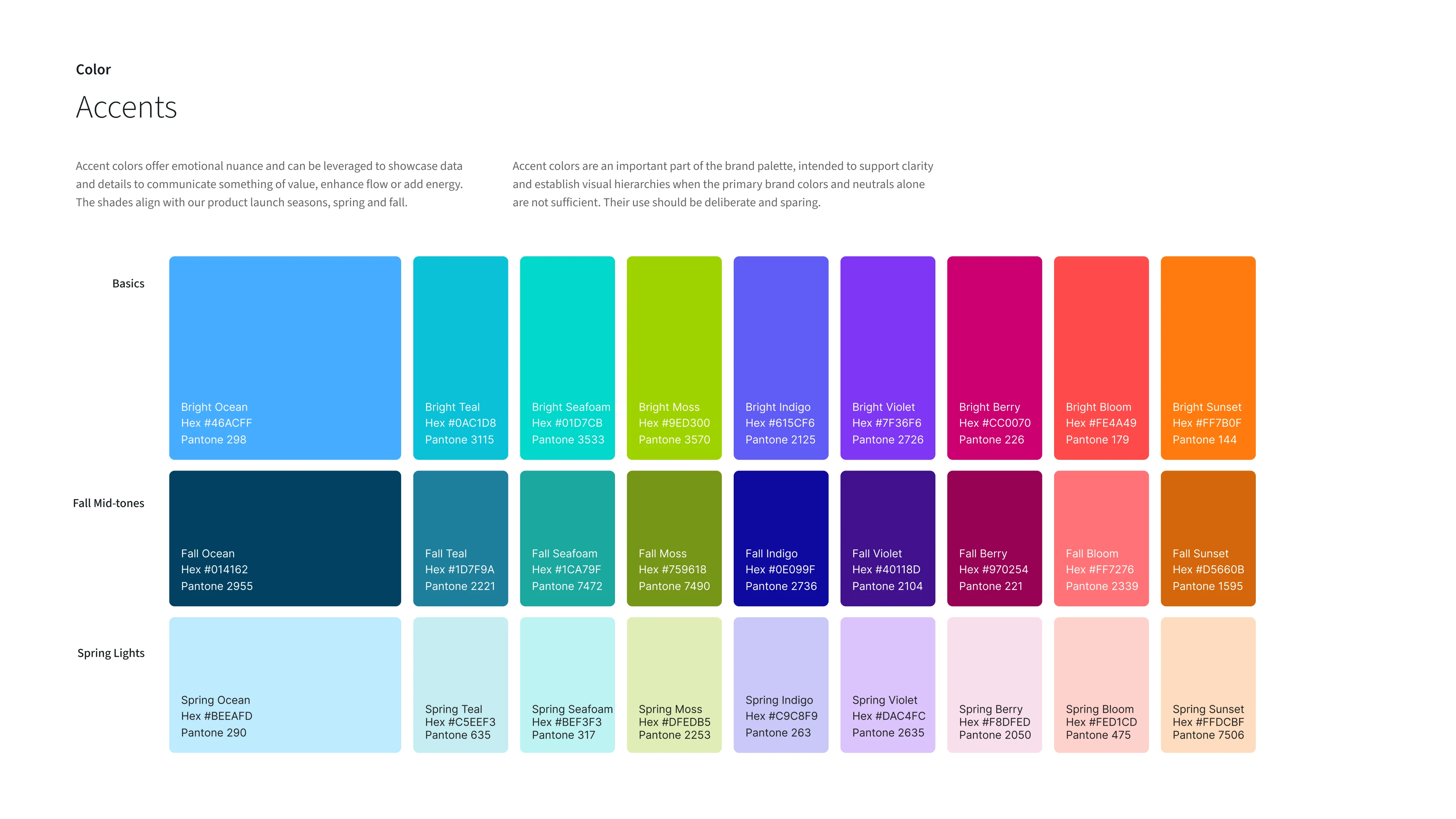
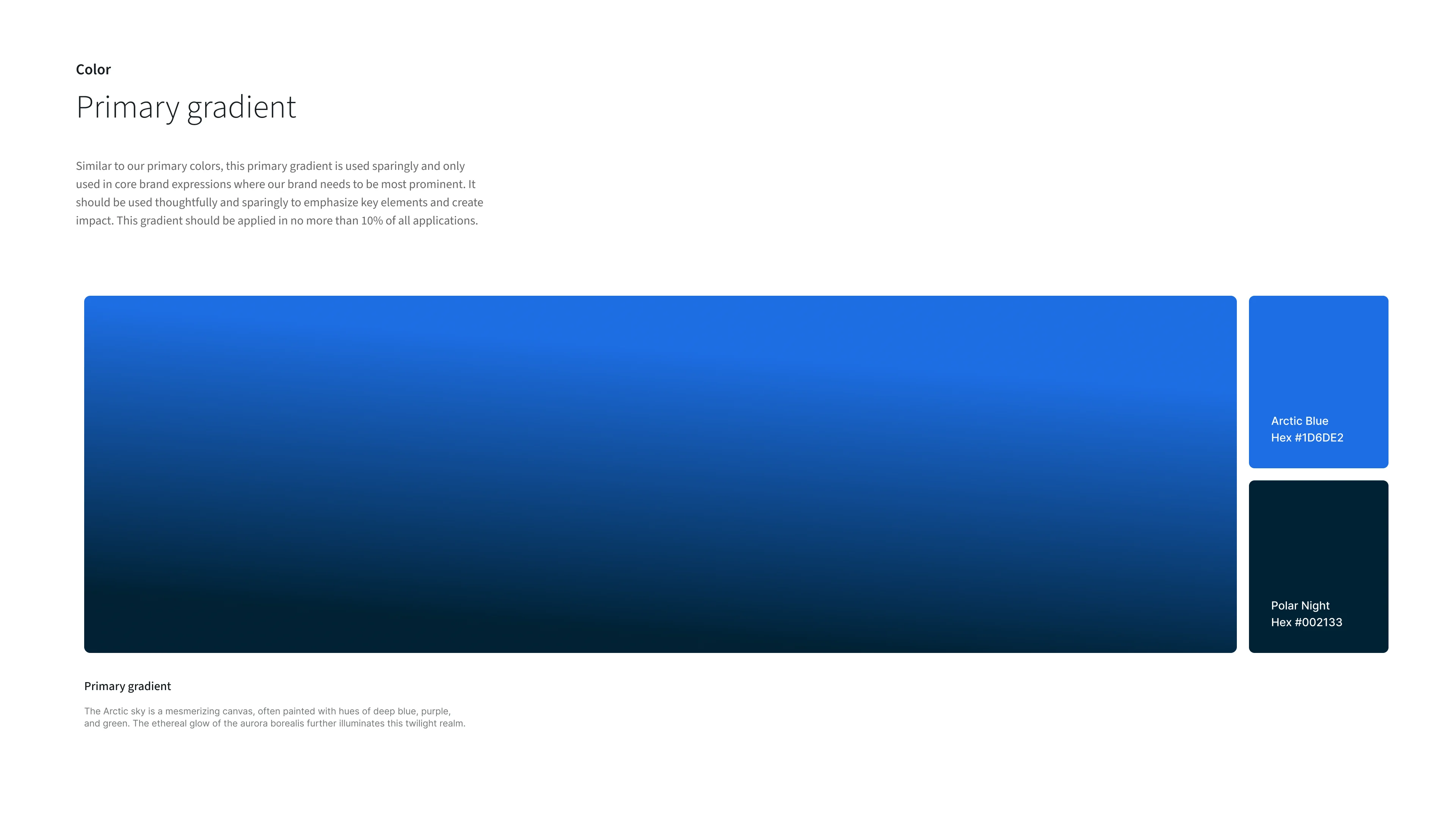
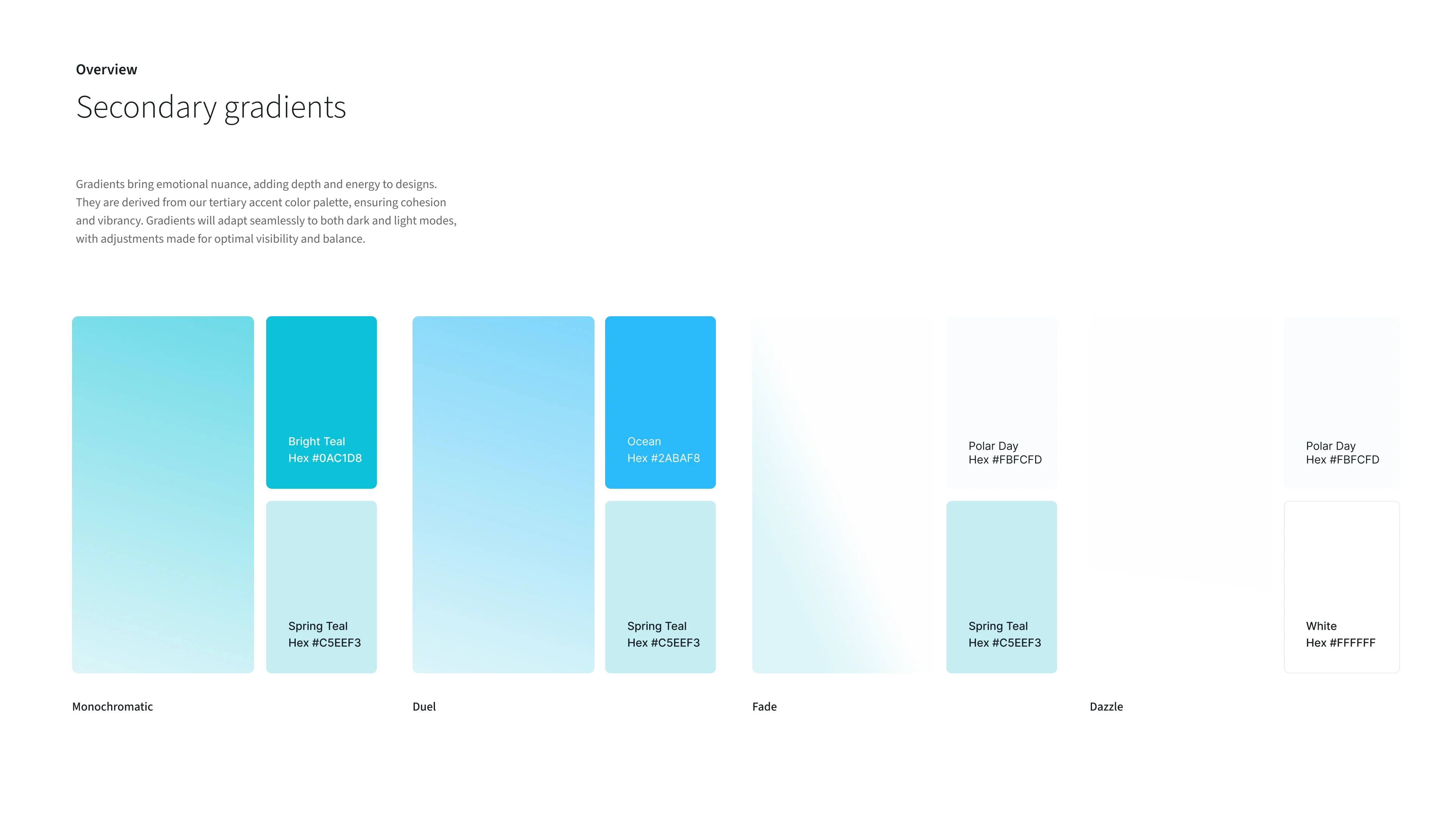
Color system
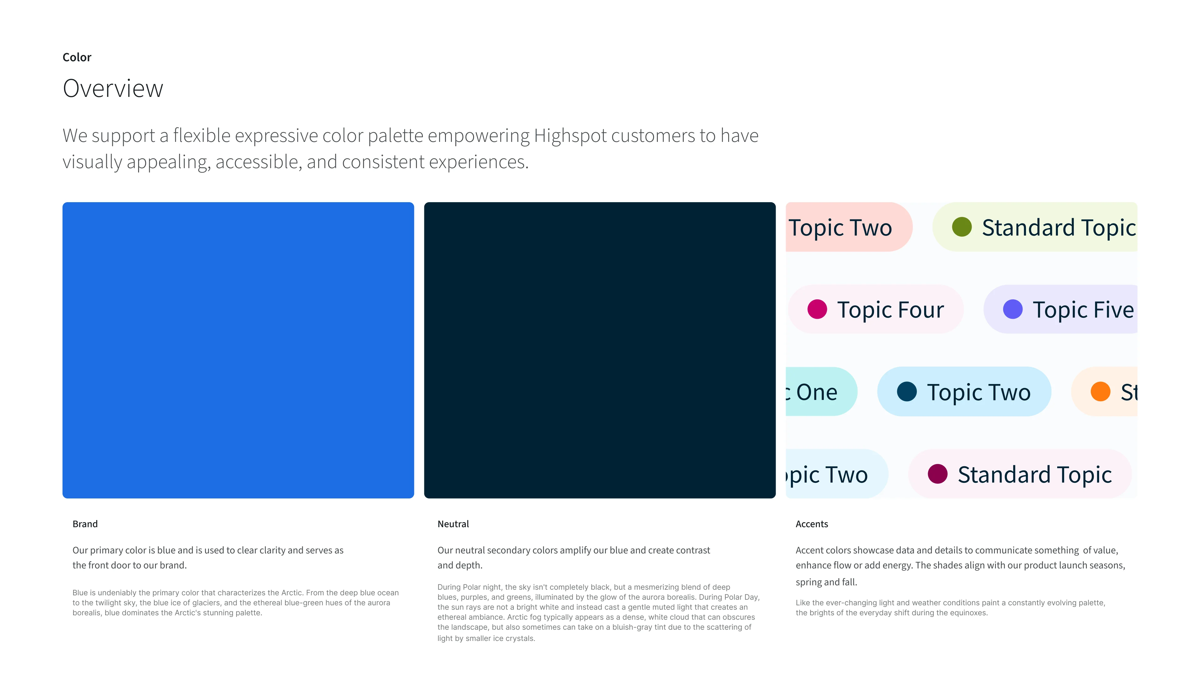
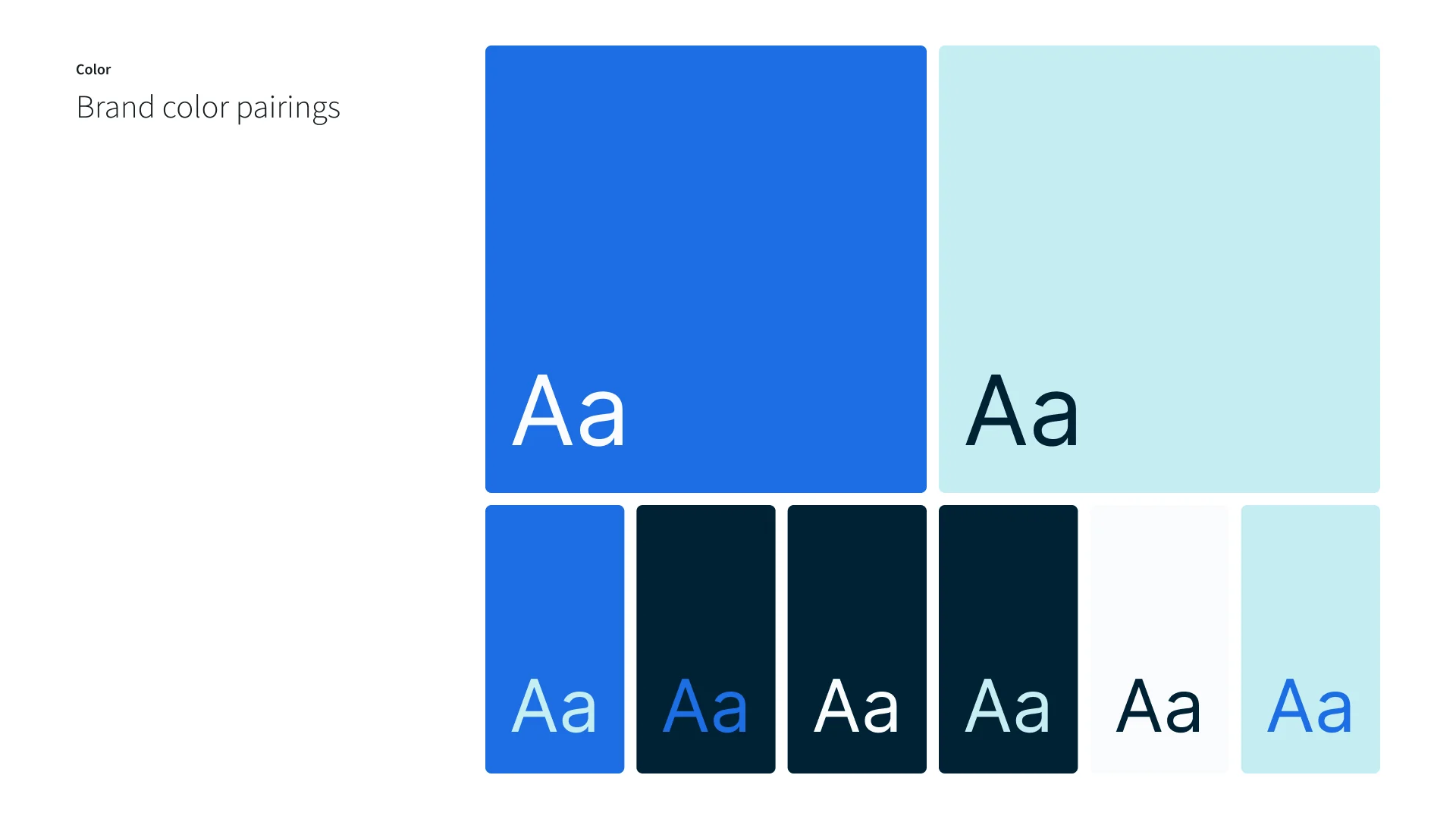
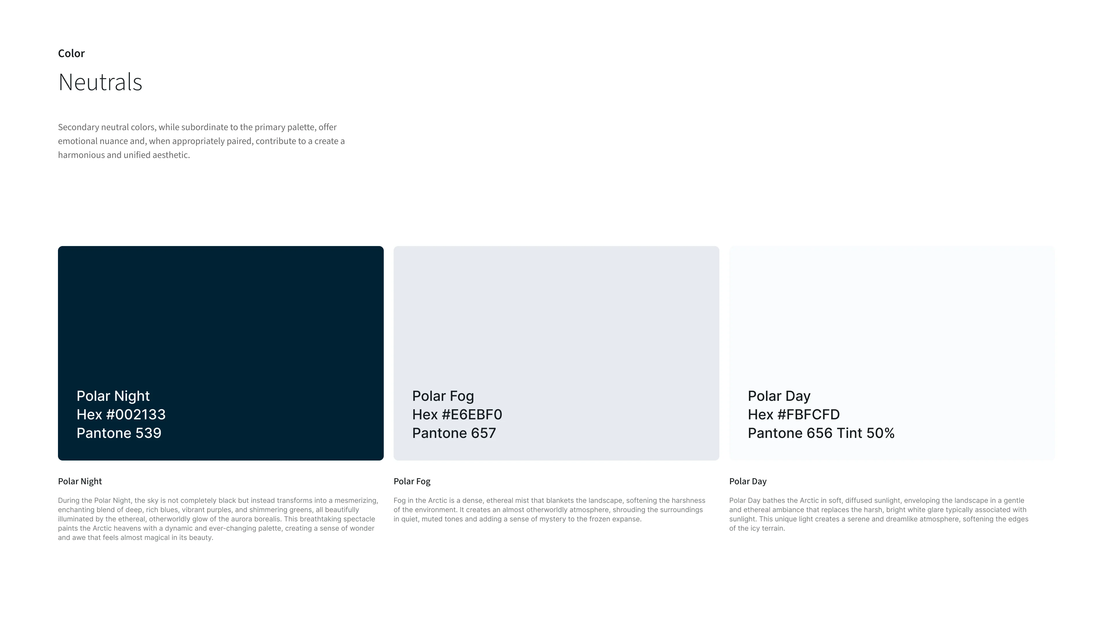
As my primary contribution to the Arctic brand, I owned the full color system, establishing the primary palette, secondary neutrals, tertiary accent colors, tint ramps, and gradients that form the foundation of the visual identity.
As my primary contribution to the Arctic brand, I owned the full color system, establishing the primary palette, secondary neutrals, tertiary accent colors, tint ramps, and gradients that form the foundation of the visual identity.
Results
The work produced a unified Arctic visual language that now anchors every experience — print, digital, and product. With the foundation in place, the team is continuing to refine and extend the system, with growing influence reaching into product collaboration and beyond.
More work

Highspot website ecosystem
UI/UX design, art direction
GTM gap campaign
UI/UX design, art direction