Highspot
Marketplace
A full redesign of the Highspot Marketplace, a public-facing storefront on the Highspot marketing website that surfaces third-party content, training, and enablement packages available for installation directly into the Highspot platform. The project addressed foundational UX and discoverability issues while aligning the visual design to Highspot's refreshed brand.
UI/UX Design

The ask
The Marketplace had grown significantly in content volume but the design hadn't kept pace. Cards lacked the metadata needed to help users quickly evaluate listings, filtering was limited, and the overall visual system felt disconnected from the refreshed Highspot brand. The scope included a redesign of the main listing page, listing detail pages, publisher pages, filtered and search results states, and the underlying card component system.
Previous designs
The existing Marketplace relied on large thumbnail images with publisher logos as the primary card treatment. With multiple listings per publisher, the grid quickly became visually repetitive and made it difficult to distinguish between offerings at a glance. Cards lacked category tags, requiring users to click through to understand what a listing contained. The filter system was minimal and the detail pages felt structurally inconsistent with the rest of the Highspot marketing site.
The existing Marketplace relied on large thumbnail images with publisher logos as the primary card treatment. With multiple listings per publisher, the grid quickly became visually repetitive and made it difficult to distinguish between offerings at a glance. Cards lacked category tags, requiring users to click through to understand what a listing contained. The filter system was minimal and the detail pages felt structurally inconsistent with the rest of the Highspot marketing site.


The design
The redesign focused on elevating the card system and overall visual language to match the refreshed Highspot brand while solving the core UX gaps in the existing experience. A new card component replaced the redundant thumbnail treatment with a slim branded color bar plus the publisher logo and introduced category tags for faster content evaluation. Publisher pages and listing detail pages were restructured for better hierarchy and consistency across the storefront.
The redesign focused on elevating the card system and overall visual language to match the refreshed Highspot brand while solving the core UX gaps in the existing experience. A new card component replaced the redundant thumbnail treatment with a slim branded color bar plus the publisher logo and introduced category tags for faster content evaluation. Publisher pages and listing detail pages were restructured for better hierarchy and consistency across the storefront.


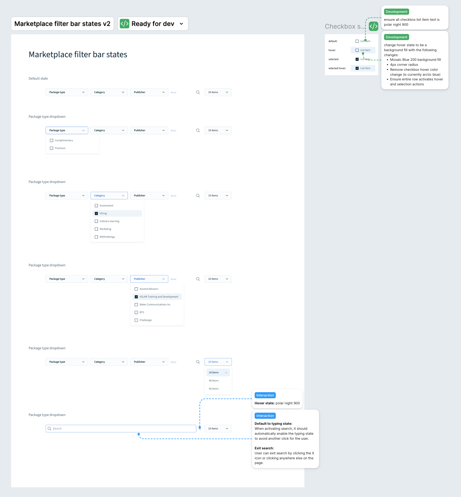
Discoverability and filtering
Cards were redesigned with a slim branded color bar, the publisher logo and category tags, giving users the context they need to evaluate listings without clicking through. The filter bar consolidates package type, category, and publisher filtering alongside search into a single persistent bar. Listing detail pages were restructured to lead with the most decision-relevant content, with requirements and installation guidance organized below.
Cards were redesigned with a slim branded color bar, the publisher logo and category tags, giving users the context they need to evaluate listings without clicking through. The filter bar consolidates package type, category, and publisher filtering alongside search into a single persistent bar. Listing detail pages were restructured to lead with the most decision-relevant content, with requirements and installation guidance organized below.


More work

Highspot navigation
UI/UX Design
Community login experience
UI/UX Design