Highspot
Navigation redesign
A redesign of Highspot's main site navigation, covering information architecture planning in close collaboration with marketing, visual alignment to the updated brand, and a set of meaningful interaction upgrades, including a double-stacked nav structure, an on-scroll collapse behavior, and a shift to a full-bleed dropdown experience.
UI/UX Design · Information Architecture

The ask
Reimagine Highspot.com’s global navigation and footer to reflect the company’s evolution into an enterprise brand. The goal was to design a more intuitive, scalable system that improves how users discover and access content, while supporting ongoing SEO growth.
I was tasked with creating a cleaner, more structured navigation experience that strengthens visual hierarchy, increases clickability, and aligns with modern UX and web best practices. This included addressing known performance gaps such as low engagement in key areas, unclear labeling, and limited responsiveness across localized experiences.
The work also needed to establish a flexible, pattern-based framework that could scale with future content and marketing needs, while elevating the overall look and feel to meet enterprise expectations across both desktop and mobile.
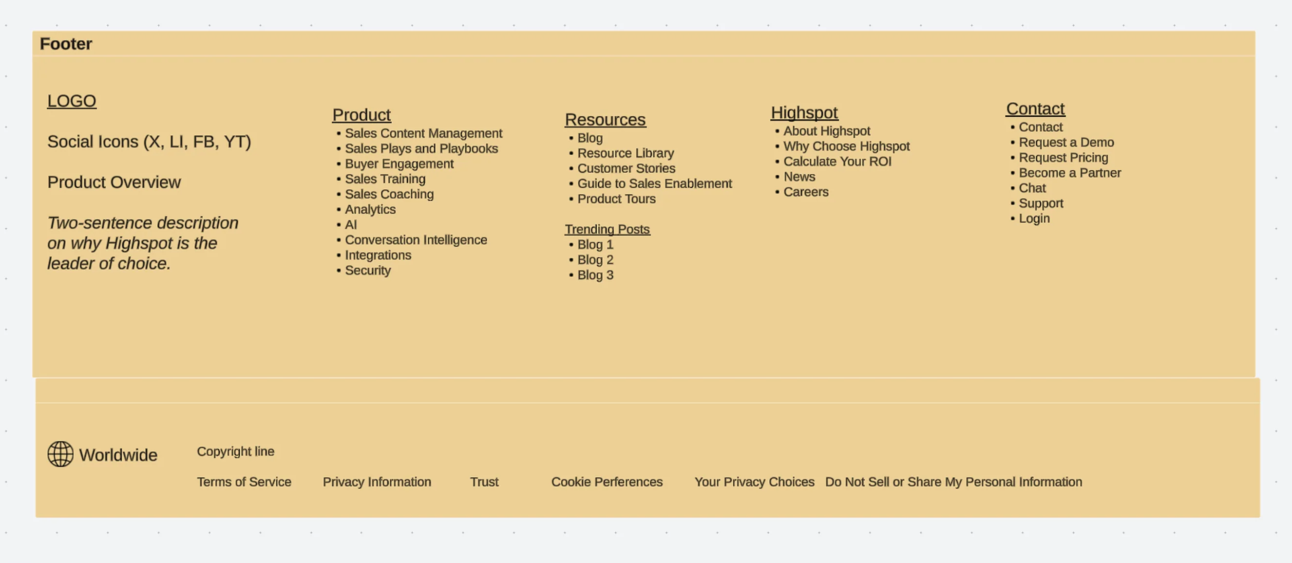
Previous design
The previous navigation reflected the old brand and lacked refinement, hover interactions were inconsistent and the overall structure felt underdeveloped. As the site grew, it also needed to accommodate a significantly larger page count and a more scalable IA structure to support ongoing SEO expansion.
The previous navigation reflected the old brand and lacked refinement, hover interactions were inconsistent and the overall structure felt underdeveloped. As the site grew, it also needed to accommodate a significantly larger page count and a more scalable IA structure to support ongoing SEO expansion.

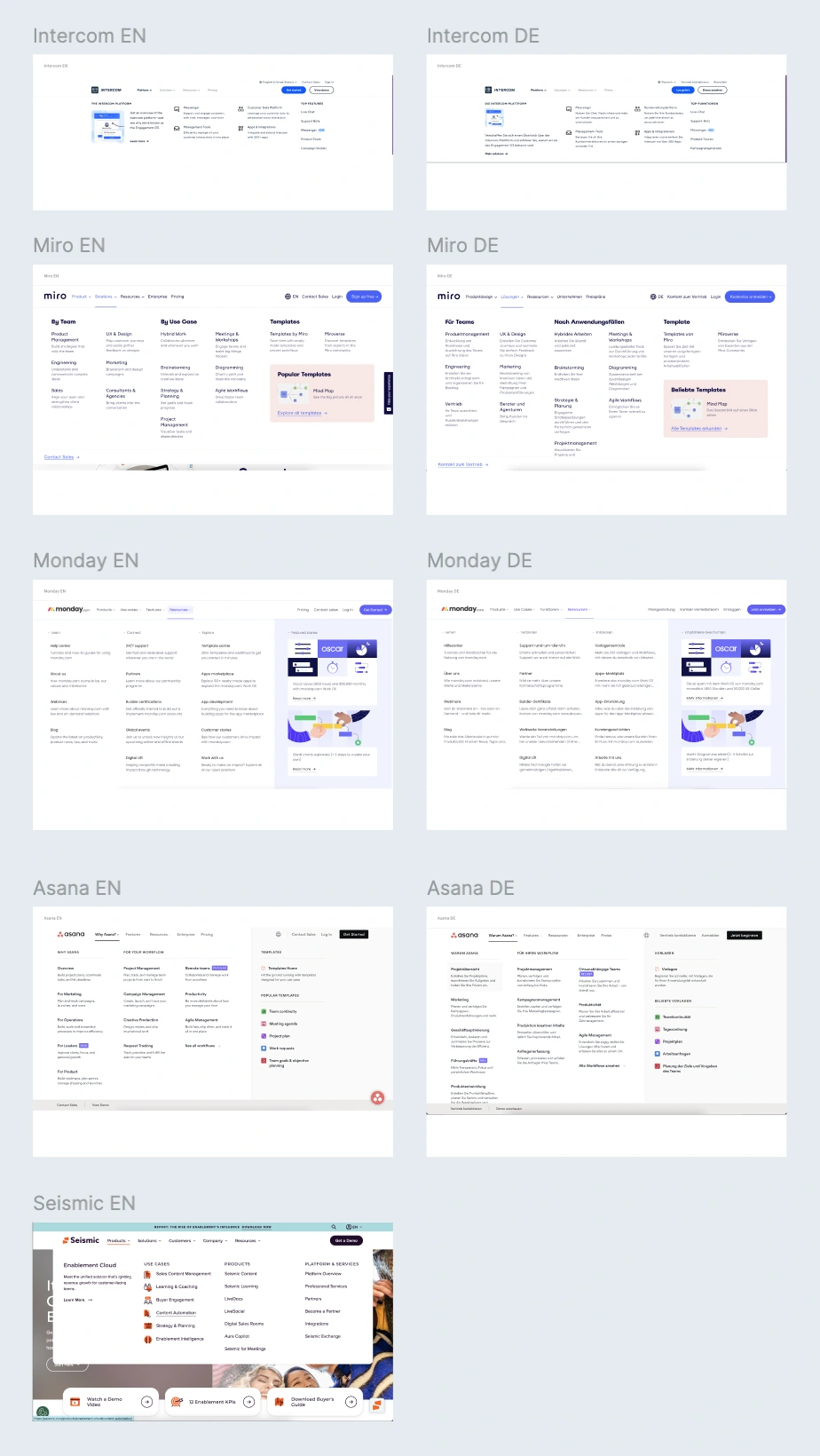
Planning and strategy
The design process began with a competitive analysis of SaaS navigation patterns, followed by a navigation and footer workshop across the web team to align on information architecture before moving into design. A sitemap was created to communicate the full site structure and serve as a shared reference throughout the project.
The design process began with a competitive analysis of SaaS navigation patterns, followed by a navigation and footer workshop across the web team to align on information architecture before moving into design. A sitemap was created to communicate the full site structure and serve as a shared reference throughout the project.


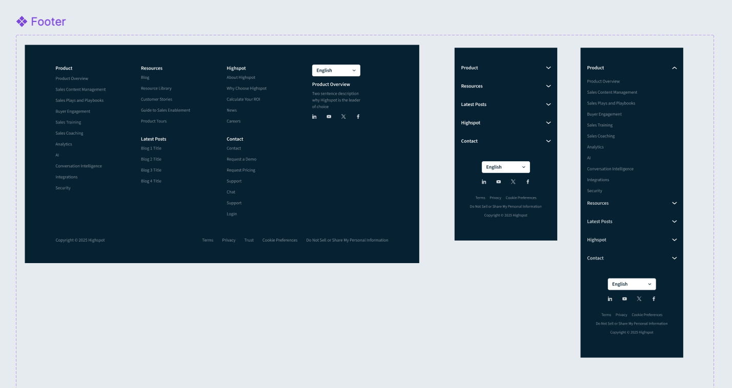
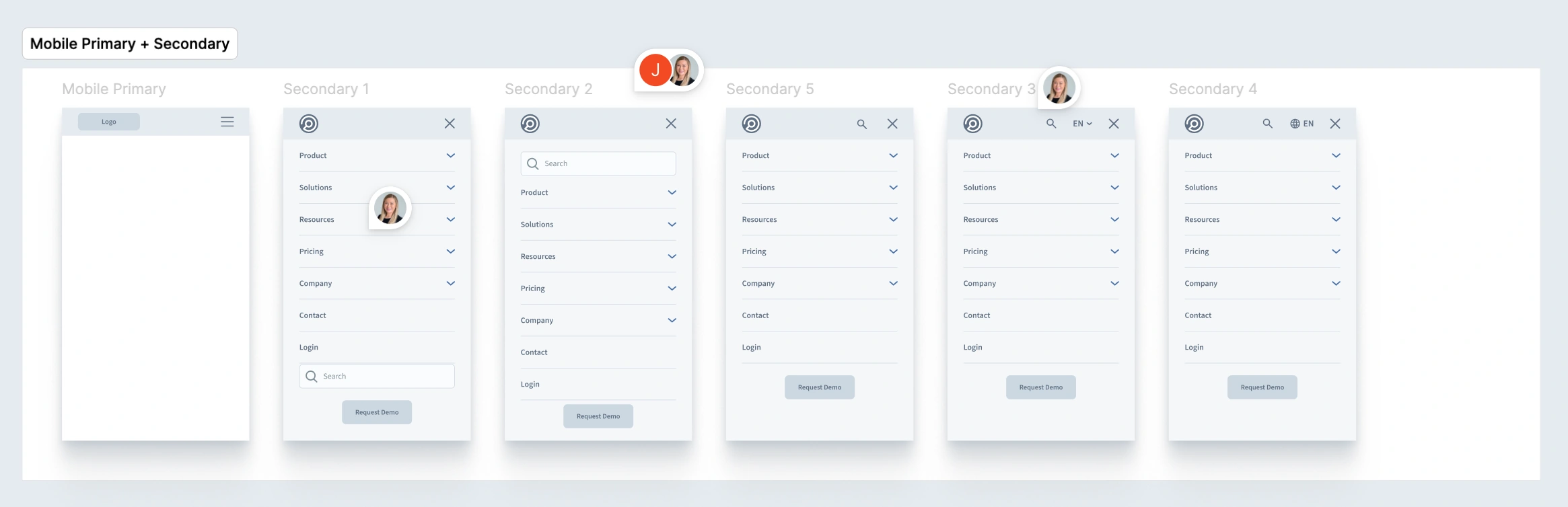
The design
After exploring dozens of variants with design and marketing stakeholders, the final direction introduced a double-stacked navigation with a utility bar above the primary nav. Secondary actions including search, language selector, contact, and login were offloaded to the utility bar, reducing clutter and elevating the Request Demo button as the primary CTA. The result is a cleaner hierarchy that improves scannability and scales across breakpoints.
After exploring dozens of variants with design and marketing stakeholders, the final direction introduced a double-stacked navigation with a utility bar above the primary nav. Secondary actions including search, language selector, contact, and login were offloaded to the utility bar, reducing clutter and elevating the Request Demo button as the primary CTA. The result is a cleaner hierarchy that improves scannability and scales across breakpoints.


Explorations
Dozens of primary nav, dropdown, mobile, and footer variations were explored before landing on the final direction.
Dozens of primary nav, dropdown, mobile, and footer variations were explored before landing on the final direction.


Results
Delivered a fully redesigned global navigation system that significantly improved clarity, usability, and scalability across Highspot.com. The new experience introduced a stronger visual hierarchy, clearer content organization, and more intuitive interaction patterns, making it easier for users to find and engage with key pages.
The updated navigation aligned nomenclature with SEO best practices, reduced redundancy, and surfaced high-value content more effectively, contributing to improved click-through rates and overall engagement. A more prominent and accessible system for search, language selection, and conversion points also helped streamline the user journey.
The solution established a flexible, pattern-based framework that supports ongoing content growth and SEO expansion, while elevating the site’s visual language to better reflect an enterprise brand. It was successfully implemented across desktop and mobile, with responsive considerations for localization, setting a strong foundation for future enhancements.
More work

Marketplace
UI/UX Design
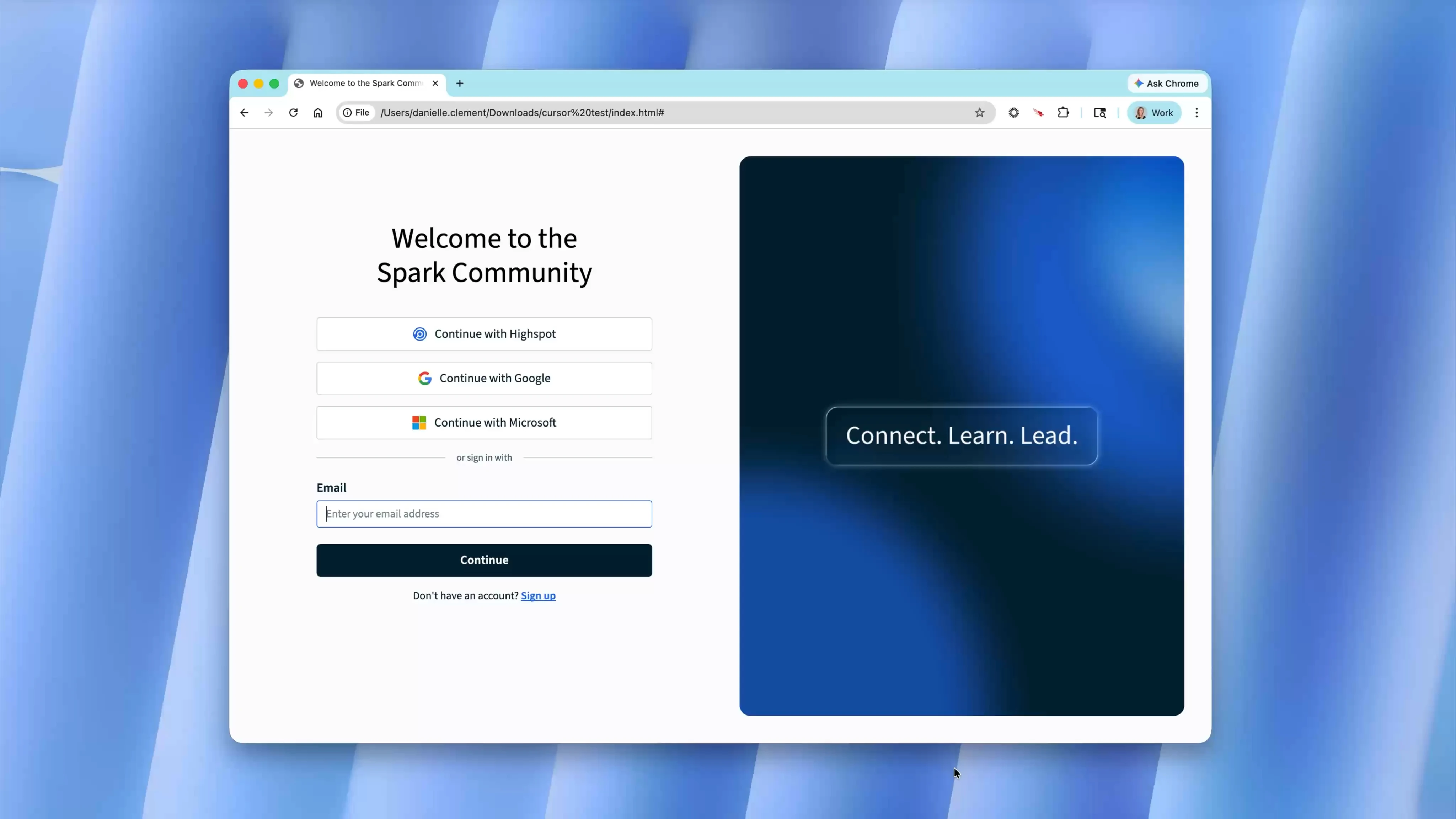
Community login experience
UI/UX Design